I love decorating a mantel for spring, and pastel spring mantel decor DIY ideas are my go-to when I want a gentle, fresh look. These pastel spring mantel decor DIY ideas work well because soft colors and mixed textures bring a calm, lifted mood to living rooms, entryways, or over a cozy fireplace.
I often mix paper flowers, painted jars, and linen ribbons while sipping tea—those small, handmade touches feel like a warm welcome.
These projects fit all skill levels and can be adjusted to match a neutral, blush, or mint palette for a cheerful mantel display.
Handmade Pastel Floral Garland Across Mantel

A strand of paper and fabric flowers in blush, mint, and buttercream adds a light-hearted rhythm across a mantel. Combine crepe paper blooms with felt leaves and thin jute or satin ribbon for a soft, layered texture. Metals like brass or copper in small accents lift the palette, while a neutral linen runner anchors the display. I like draping the garland slightly asymmetrical—one end higher—to give movement and a casually styled look that pairs well with a mirror or framed art behind it.
Styling Tips
- Anchor ends with small vintage books or ceramic weights.
- Layer a runner underneath to add depth and contrast.
- Add tiny battery LED fairylights for soft evening glow.
Paper Peony Cluster with Soft Pastels

Create oversized paper peonies in soft coral, dusty rose, and pale peach to form a clustered focal above the mantel. Use heavyweight crepe paper for petals and a wrapped wire stem so blooms keep shape and texture. Mix in paper eucalyptus sprigs in muted sage for balance. The matte paper petals contrast nicely with a glossy ceramic vase or a distressed wooden frame, and the overall palette reads as airy and welcoming. I like arranging three differently sized peonies for a handcrafted, collected-from-the-garden feeling.
Styling Tips
- Place the largest bloom slightly off-center for a relaxed look.
- Mix matte and glossy vases to add visual interest.
- Keep surrounding decor minimal so blooms remain the focal point.
Painted Mason Jars in Spring Hues
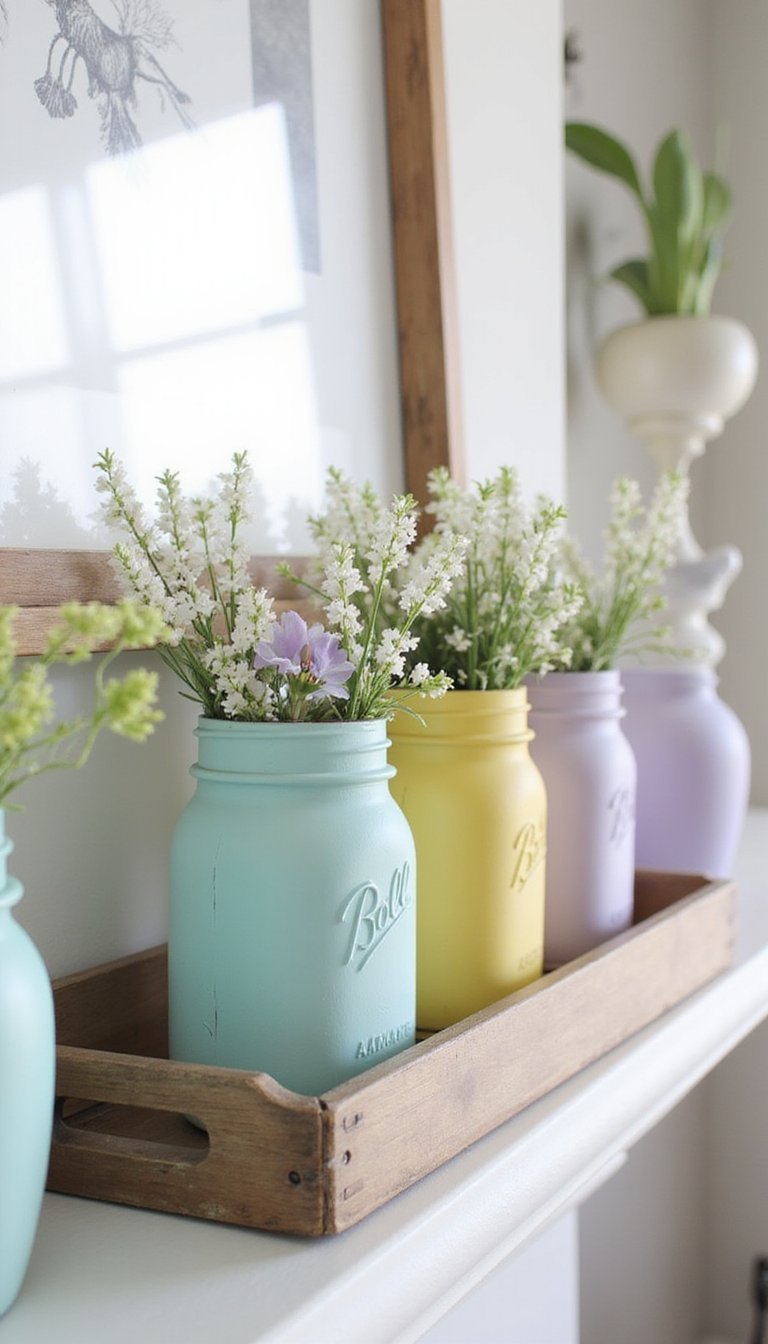
Upcycle mason jars with a wash of chalk paint in pale aqua, lemon, and lavender to create a unified pastel cluster. Lightly sand the edges for a soft vintage feel, then fill jars with ranunculus, tulips, or dried grasses for texture. Mix in a couple of taller taper candles in muted tones to vary heights, and use a wooden tray or a narrow shelf runner in warm oak tones to ground the arrangement. This look blends rustic materials with a fresh color story that brightens a hearthside vignette.
Styling Tips
- Group jars in odd numbers for natural balance.
- Use varied jar heights and ribbon trims for visual layers.
- Include one unpainted jar for contrast and texture.
Pastel Egg Nest Display for Spring Mantel

Create a whimsical mantel display using nests made from grapevine and preserved moss, each cradling pastel-dyed eggs in blush, mint, and dove gray. Add tiny sprigs of baby’s breath and a few miniature ceramic birds for delicate texture. Arrange nests along the shelf with small stacks of books and a mirrored tray to reflect light. The natural fibers in the nests paired with the soft eggshell palette feel cozy without being overly themed, making it easy to leave up through the whole season.
Styling Tips
- Group nests at varying heights using small risers or boxes hidden behind greenery.
- Scatter a few loose eggs for a relaxed, hand-placed feel.
- Add a soft garland of eucalyptus to tie elements together.
Watercolor Backdrop Panel for a Focal Point

Paint a thin plywood panel with dreamy watercolor washes in pale lilac, seafoam, and buttercream to lean behind mantel objects. The soft gradient pairs well with white plaster vessels, rattan bowls, and matte brass candleholders. Textural contrast between the painted panel’s smooth finish and woven or ceramic accents helps items pop without overwhelming the space. I sometimes swap the palette to match cushions or blooms in the room, which keeps the mantel feeling intentional and well coordinated with the rest of the living area.
Styling Tips
- Lean the panel slightly against the wall rather than hanging for casual style.
- Echo one panel color in nearby textiles to unify the scheme.
- Layer smaller frames or a vase in front to add depth.
Layered Frames and Botanical Prints on Mantel
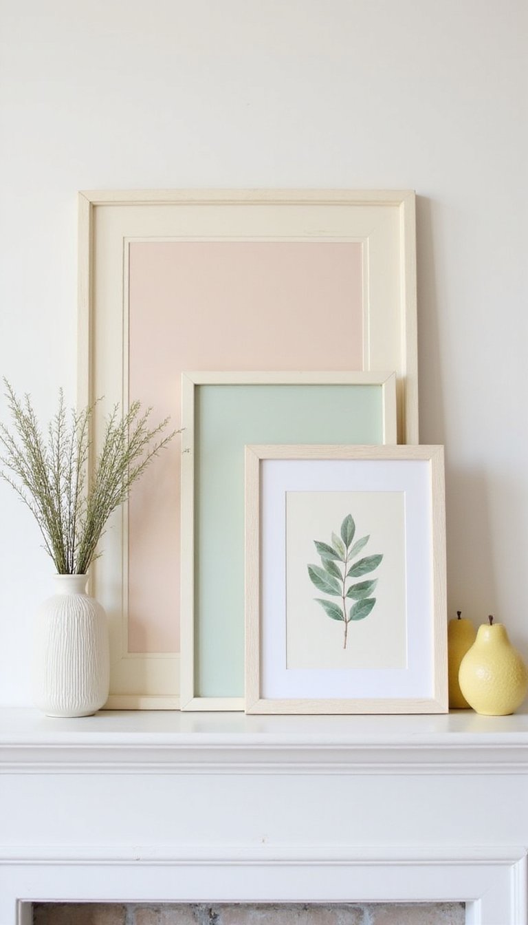
Lean several frames of different sizes with pastel botanical prints—blush peony sketches, mint fern studies, and soft lemon blossoms—into a relaxed gallery across the mantel. Use thin wood frames painted in off-white or pale gray for a soft edge, and layer smaller frames in front to create a windowed collage effect. The paper texture of the prints combined with wooden frames and a sprig-filled vase makes the whole display feel curated and gentle, ideal for a living room that favors calm, garden-inspired design.
Styling Tips
- Mix horizontal and vertical frames to keep the eye moving.
- Place a low vase in front of one frame to create foreground interest.
- Keep matting neutral to highlight the pastel hues inside.
Pom-Pom Garland That Feels Playful and Light

Make a pom-pom garland using wool in soft pastels—powder blue, pale peach, and mint—and string them on natural twine for a fun, tactile mantel accent. Mix small and medium pom-poms, and add a couple of flat cotton tassels to break up the round shapes. The cozy wool texture pairs nicely with a boucle throw draped over a nearby chair and with ceramic vases in cream tones. I like how the garland brings a handcrafted, joyful energy without feeling overly busy.
Styling Tips
- Drape the garland loosely for a relaxed appearance.
- Vary pom-pom sizes and spacing for rhythm.
- Repeat one pom-pom color elsewhere on the mantel to tie the look together.
Tassel Garland with Muted Pastel Thread

Create long tassels from embroidery floss or silk ribbon in muted pastels and hang them along the mantel for vertical motion. Soft pinks, washed aqua, and pale mustard add an unexpected modern touch. Pair the tassels with a slim metallic candle holder and a textured linen runner to balance shine and softness. I enjoy how the tassels catch a breeze and add a playful line without obscuring taller decor pieces like framed art or taller vases backed by the fireplace.
Styling Tips
- Trim tassel lengths to create a gentle cascade effect.
- Mix fiber types—silk and cotton—for subtle sheen variation.
- Secure tassels with small, discreet clips to keep them in place.
Clustered Candles with Pastel Holder Mix
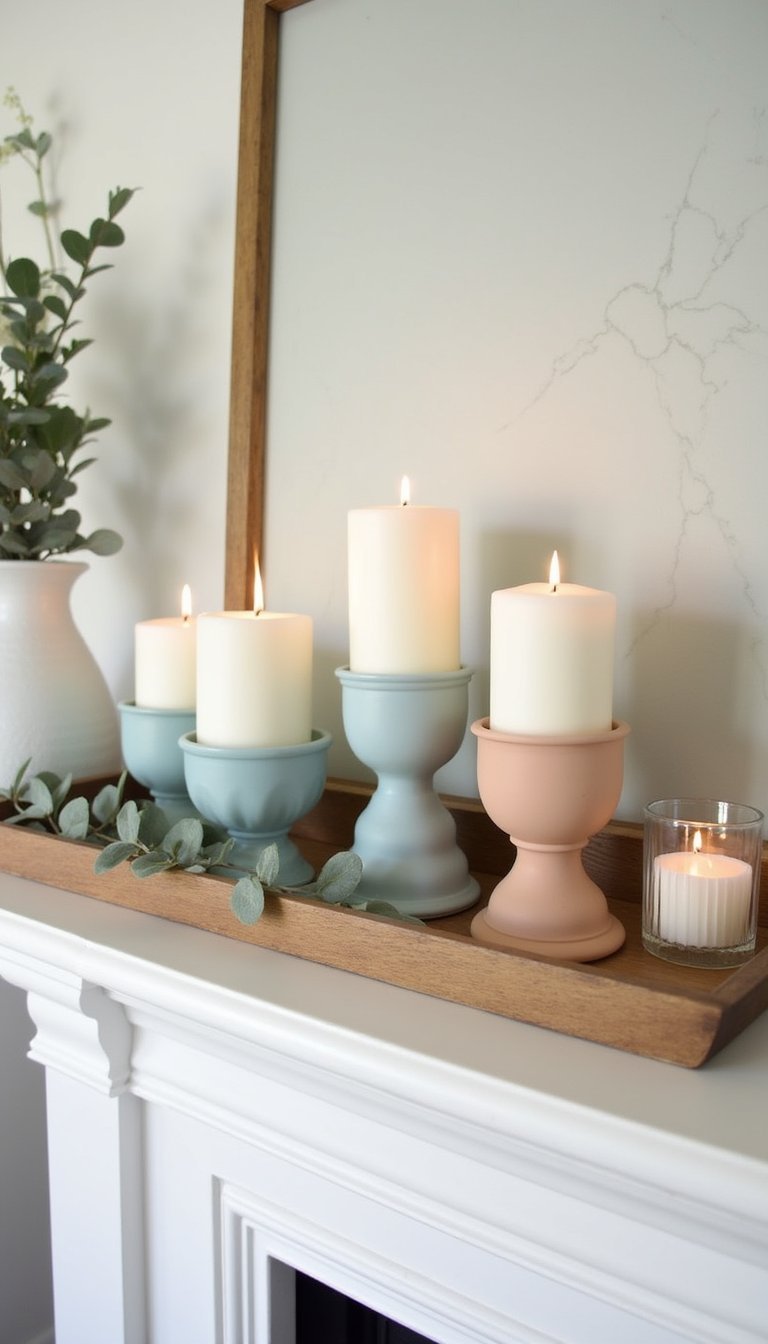
Group pillar and votive candles in soft shades—powder blue, pale peach, and cream—on a stone or wood tray for a candle cluster centerpiece. Add painted terra cotta holders and a few glass votives for reflective moments of light. The combination of warm wax, matte ceramic, and clear glass creates varied texture while the pastel palette keeps the arrangement light and breezy. I often add a small sprig of rosemary or eucalyptus around the base for scent and a green contrast that complements the pastel hues.
Styling Tips
- Place taller pillars at the back and shorter votives in front.
- Use a tray to contain wax spills and add structure.
- Introduce a single fragrant sprig to enliven the display.
Vintage Books Recovered in Pastel Papers

Wrap old hardcovers in pastel craft paper or fabric scraps—mint, blush, and soft lemon—and stack them in small piles across the mantel. Tie a thin ribbon or baker’s twine around a few to add a gift-like charm, then top stacks with a small bud vase or antique brass figurine. The mix of paper texture and aged book spines reads warm and collected, lending a cottage feel suitable for a library nook or a fireplace ledge. I like flipping through the books from time to time; they feel welcoming and tactile.
Styling Tips
- Vary stack heights to create stepped interest.
- Use a ribbon color that repeats in other mantel elements.
- Place a small vase or ceramic object on top to finish the stack.
Mini Wreaths Hung Along the Mantel Shelf

Make tiny wreaths from seeded eucalyptus, baby eucalyptus, or dried heather and hang them with ribbon spaced evenly along the mantel. Paint the ribbons in soft pastel shades and let them trail slightly for a relaxed look. Each wreath brings a natural fragrance and a hint of garden freshness, and their round forms introduce a repeating motif when combined with vases and candles. I like switching wreath contents through the season, trading one herb for another to keep the mantel feeling seasonal and lightly aromatic.
Styling Tips
- Hang wreaths at slightly different heights for a handmade feel.
- Use a narrow ribbon color that coordinates with other mantel accents.
- Include one wreath slightly larger to act as a subtle focal point.
Glazed Ceramic Vases Painted in Soft Tones
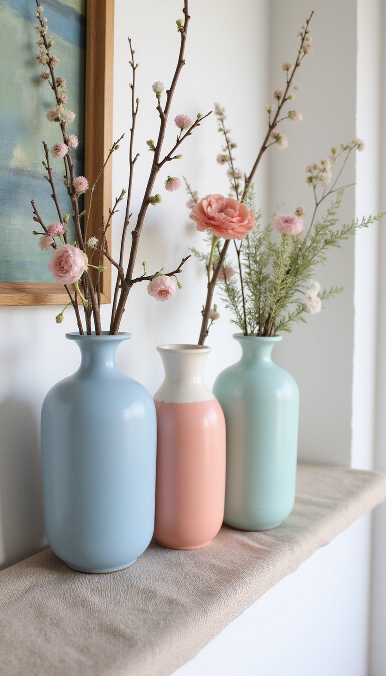
Hand-paint thrifted ceramic vases in a trio of soft tones—powder blue, pale coral, and mint—and group them with fresh branches or seasonal flowers. The glossy glaze against a matte linen runner and wooden mantel introduces a pleasing contrast of finishes. Mix taller necked vases with squat forms to add scale variety. These crafted vessels feel like tiny sculptures that anchor the mantel, and swapping flowers for dried stems after a week makes the arrangement low-maintenance while keeping the spring palette intact.
Styling Tips
- Place tallest vase slightly off-center and balance with two shorter pieces.
- Use one vase empty to highlight its color and form.
- Keep surrounding decor neutral to let glaze colors stand out.
Pastel Macramé Tassel Wall Hanging on Mantel

Create a compact macramé wall hanging using cotton rope dyed in blush and seafoam hues, and hang it just above the mantel for a textural centerpiece. Combine knotting techniques to form soft fringes and tassels that echo nearby textiles. The woven texture plays nicely against smooth plaster or painted brick behind a fireplace, and adding a couple of ceramic planters with trailing greenery softens the edges. I like how the handmade knotwork invites touch and pairs easily with rustic wooden accents for a cozy, layered shelf.
Styling Tips
- Hang slightly off-center for a relaxed, modern look.
- Combine with small planters to add living texture.
- Choose rope dyed in two complementary pastel shades for depth.
Ruffled Fabric Bunting with Mixed Pastel Prints
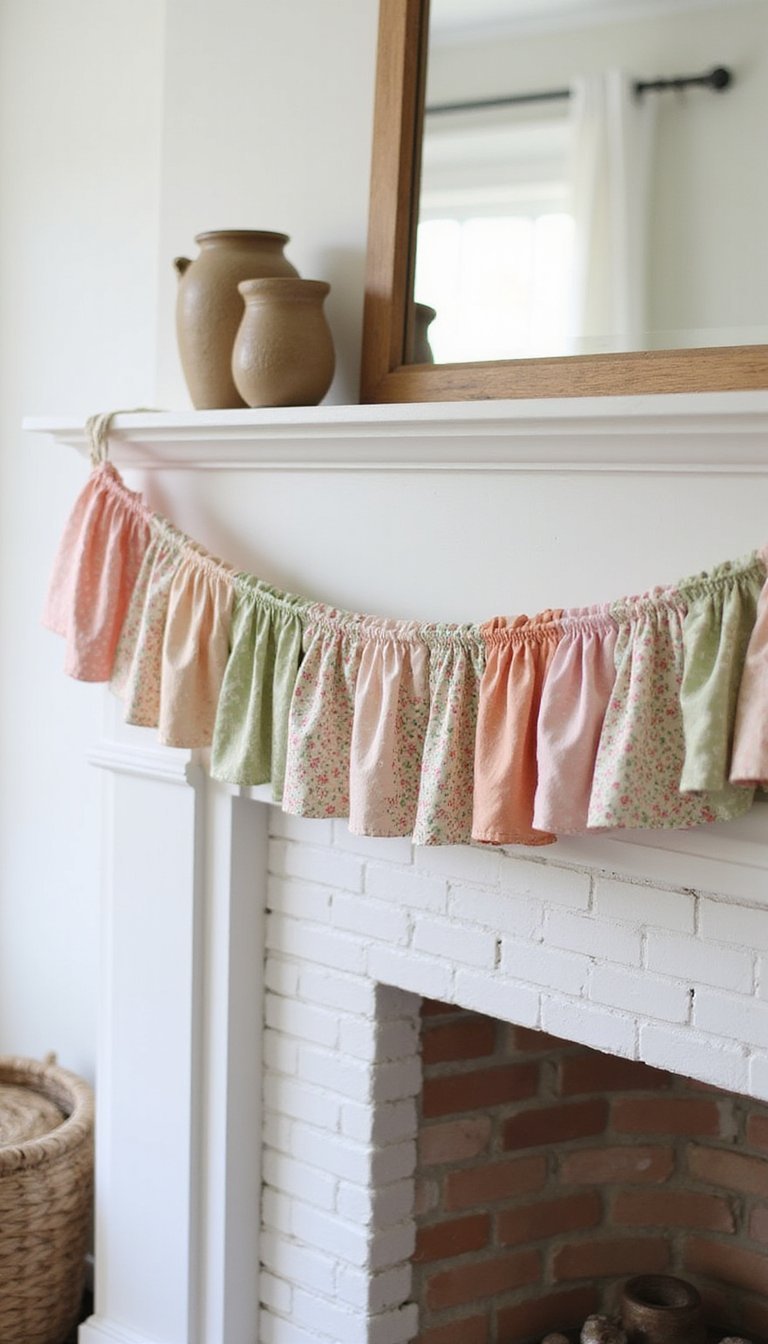
Sew small bunting flags from mixed pastel fabrics—gingham, floral, and watercolor wash—to create a ruffled banner that brings a homespun vibe to the mantel. Add a narrow wooden garland rod or thin dowel for structure, and let the fabric flags overlap for a fuller effect. The tactile cotton and linen fabrics pair well with earthenware and a woven basket nearby. I find that the little movement from the fabric makes the mantel feel welcoming and gently animated, as though it were set for a casual spring gathering.
Styling Tips
- Overlap flags slightly to create a fuller silhouette.
- Choose one print to repeat elsewhere for cohesion.
- Softly iron fabrics to keep ruffles defined without stiffness.
Pressed Flower Frames Leaning for a Fresh Feel

Collect small pressed blooms—violets, daisies, and forget-me-nots—and arrange them in slim glass frames to lean against the wall on the mantel. Use soft cream mats and pale wood frames to keep the look airy. The delicate, translucent petals introduce an intimate botanical detail that feels almost like a keepsake display. Paired with a small stack of linen-covered books and a pale ceramic dish, the pressed flowers bring a gentle, museum-like quietness to the shelf that complements a calm seating area.
Styling Tips
- Lean frames at an angle to reduce glare and add depth.
- Mix frame sizes and arrange in an overlapping cluster.
- Include a low botanical bowl to echo the floral theme.
Balloon Cluster in Subtle Powdered Colors
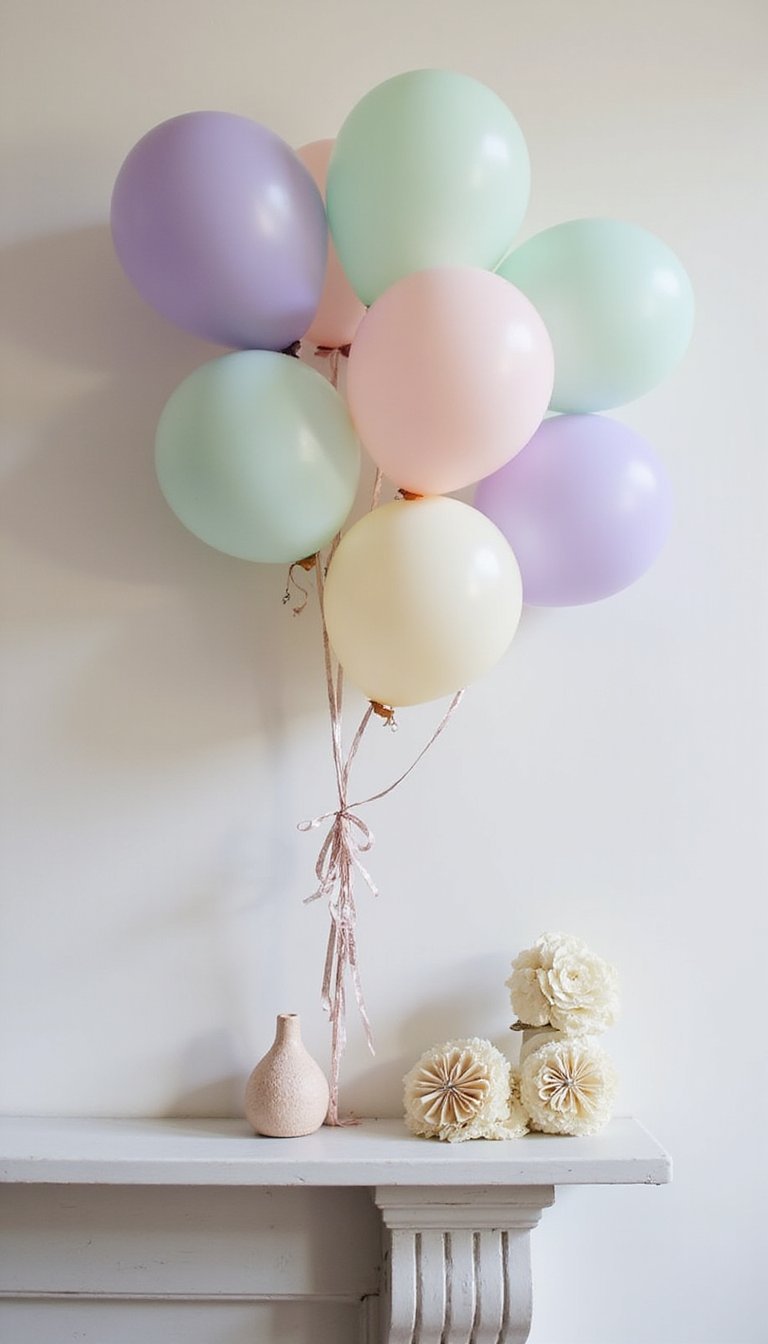
For a playful, temporary setup, group helium-free balloons in powdered pastel shades—soft lilac, pale mint, and buttercream—and anchor them with small floral weights along the mantel. Choose matte balloons to read more subdued and pair with simple paper rosettes or small pinwheels for a celebratory flair without excess shine. This arrangement works well for a spring brunch or a casual gathering, and once the event is over, elements can be repurposed for tabletop decor or a vignette by a window.
Styling Tips
- Keep balloon sizes varied for a natural cluster.
- Use matte finishes to maintain a soft aesthetic.
- Repurpose paper rosettes as coasters or tabletop accents later.
Hydrangea Spray with Blush and Mint Accents

Arrange a low, wide vase filled with hydrangea blooms in blush tones and minty green foliage for a lush mantel statement. Combine fresh stems with a few dried pods to introduce texture and a hint of earthiness. The voluminous blooms contrast nicely with streamlined, mid-century mantle objects—think a slim clock or brass bowl—for a balanced mix of vintage and floral. I often swap in a pale table runner underneath to catch stray petals and to visually tie the florals to other pastel accents nearby.
Styling Tips
- Trim stems at varied lengths to create a rounded, organic silhouette.
- Place lower objects like books or a tray beneath the vase to lift it slightly.
- Add a single contrasting bloom in white for subtle highlight.
Fruit Bowl with Pastel Pears and Blossoms

Fill a shallow ceramic bowl with pale green and blush-hued pears, interspersed with cut blossom stems and small sprigs of ivy. The organic curves of fruit offset the linear mantel shelf, and the subtle sheen of fruit skin plays with matte ceramics and woven placemats. This edible-styled display lends a casual, kitchen-to-livingroom crossover that reads homey and inviting; it works especially well on mantels near dining areas. I enjoy swapping fruit varieties as the season moves for a fresh look from week to week.
Styling Tips
- Choose a shallow bowl to keep the arrangement low and open.
- Mix a couple of blossom stems among the fruit for softness.
- Pair with a small cutting board or wooden spoon for a kitchen link.
Painted Candle Holders with Delicate Patterns

Upcycle plain candle holders with hand-painted motifs—tiny florals, dots, or stripes—in pastel inks and matte finishes. Use a soft palette of dove gray, blush, and pale celery to keep the look muted and cohesive. The small-scale patterns introduce a crafted detail that pairs beautifully with simple taper candles and a neutral mantel surface. I enjoy pairing painted holders with unpainted ceramics to create a balance between handmade pattern and clean shapes, giving the mantel personality without making it feel cluttered.
Styling Tips
- Paint one side only for a light, modern update.
- Mix patterned holders with plain ones for calm contrast.
- Repeat one painted color elsewhere to unify the display.
Chalkboard Plaque with Spring Phrase in Pastels

Paint a small chalkboard plaque with a soft pastel border and write a brief spring phrase or single word in colored chalk for a casual, seasonal note. Frame it in distressed wood and set it at one end of the mantel to pair with potted herbs and a stack of postcards or pressed flowers. The matte chalk surface plays nicely with glossy ceramics and woven textures nearby. I often change the message to reflect small moments—an upcoming brunch or a welcome for guests—which keeps the mantel feeling personal and purposeful.
Styling Tips
- Use colored chalk to pick up nearby pastel accents.
- Lean the plaque rather than hanging for a relaxed look.
- Add a small potted herb to bring scent and life to the vignette.
Teacup Planters and Saucer Grouping on Mantel

Repurpose delicate teacups as tiny planters for succulents, baby herbs, or tiny primroses in pale pastel glazes. Arrange a trio on mismatched saucers with a linen doily beneath for a tea-party inspired mantel vignette. The porcelain’s subtle sheen contrasts with rougher elements like woven baskets or a carved wood candle holder, and the small scale makes the display feel intimate. I enjoy the small rituals of watering these teacup plants and watching them thrive—each little pot becomes a cheerful, living accent.
Styling Tips
- Group teacups in odd numbers for an organic look.
- Mix different cup patterns but maintain a cohesive pastel palette.
- Place a saucer beneath each to protect the mantel surface.